The Aurubis logo over the years
From the smelting tools of Norddeutsche Affinerie to the modern Aurubis triangle
“Smelting tools” logo
In 1953, Norddeutsche Affinerie introduced a logo made up of the three smelting tools as its company symbol: pick, tap and fork. It formed a triangle with the letters “NA” in the middle. After the upheaval of the war had ended, NA had managed to get itself back on its feet commercially and had evolved into a major copper producer.
For a company as large as Norddeutsche Affinerie, which had well over 1,000 employees at the time, a corporate logo was essential. So the logo was developed from pictures of the typical tools used by workers in the smelting plant. At the time, such designs were based on the emblems and symbols of old guilds, and artful, detailed designs were popular. However, little thought was given to the notion that a logo would also need to look good when reproduced on a much smaller scale on business cards or ballpoint pens, and that it would need to help create a uniform corporate image. As a result, the company logo appeared in different shapes and colors.


Starting 1991: Norddeutsche Affinerie logo
Even though the logo wasn’t always user-friendly, the smelting tools weren’t replaced until 1991, when the 125th anniversary of the company was marked by replacing the stylized tools with a blue triangle. The company signet made its first appearance on the 1989/90 annual report. The idea was to preserve the long tradition of the triangular arrangement of the smelting tools, while at the same time giving the logo a modern and memorable feel that was clear, clean and optimistic.
At the time, the Metallgesellschaft was an important shareholder, and their signet was blue. This prompted Norddeutsche Affinerie to choose a blue logo as well. Original considerations had included a copper color. The same font as the Metallgesellschaft was used. As a result, “Norddeutsche Affinerie Aktiengesellschaft” was placed in block capitals underneath the logo. The company’s internal magazine NA-intern reported at the time:
“ ... there is little use in being one of the most modern copper smelters in the world if we fail to constantly document this for the outside world.”
Starting 2000: NA triangle logo
However, this new logo didn’t last the 40 years of its predecessor, and by 1999 work was already under way to modernize it. After the tensely anticipated turn of the millennium, which thankfully passed without any problems, Norddeutsche Affinerie presented itself with a new image in February 2000. The logo was now shorter and more to-the-point, and the aim was to replace the complicated company name “Norddeutsche Affinerie” with “NA” in the long term, similar to the approach adopted by HP and BP. The company website was also modernized, and a corporate design was developed with the intention of using it in all publications in order to establish a uniform and consistent image. The cautious explanation in the magazine NA-intern —
“With time, […] the hope is that the abbreviation ‘NA’ will replace the malapropisms of our company name like ‘Norddeutsche’ or ‘Affi’ …”
– was appropriate, because just nine years later it was time again for a new logo – and most people still referred to NA as the “Affi”.


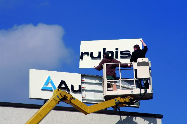
Starting 2009: Aurubis logo
After the merger of NA with Cumerio, a name change became unavoidable. Simply changing the logo wouldn’t be enough this time. The geographic identity that had once put the norddeutsch, i.e., north German, into Norddeutsche Affinerie no longer applied. The company now operated factories in seven European countries, and as Bernd Drouven announced at the first staff meeting shortly before Christmas 2008, it would have done little to boost the feeling of togetherness if the new company locations in Italy, Belgium, Bulgaria and Switzerland had been forced to put up signs saying “Norddeutsche Affinerie” over the entrances to their factories. In addition, just as predicted in 2000, the abbreviation “NA” had never really taken off, and most people continued to use the abbreviation “Norddeutsche”, which was very difficult to pronounce.
A new company name was developed that reflected the new international character of the corporation and highlighted the significance of copper as a particularly valuable metal. The name Aurubis is derived from the Latin terms aurum, “gold”, and rubrum, “red”, and can be freely translated as “red gold”.

The name change came into effect on April 1, 2009. In a joint effort and in only a short space of time, factory passes were updated, business letterhead was reprinted, and the logos visible on site buildings were replaced.
Although this marked the start of a new era for the corporation, the stylized smelting tools from the old days in the shape of the blue triangle have remained, representing the values of consistency and trust — reminding us of the company’s long tradition.